Labels

Monday 28 November 2011

Progression of our Down in Mexico Skull drawing


ORIGINAL DRAWING:

FIRST DRAFT OF FRONT COVER:

With inspiration from the Mexican Candy Skulls, we produced our own image according to the style of our music video. This skull head, drawn and coloured by Alex Harvey, shows the image we are going for on our Digipak (Mexican). We researched the different types of skulls and Mexican candy skulls. When it came to producing our own one we picked different elements off them to inspire our own skull. For example we used the idea of the upside down cross from this image:

INSPIRATION FOR FRONT COVER:


Final CD Digipak

The Front Cover:


The First Two Back Panels of the CD Digipak:


The First Panel of the Inside Part of the CD Digipak:


The Second Panel Which Holds the CD Itself:


The Third Panel of the Inside of the CD Digipak:

Plan for our CD

This is a rough layout of what our cd digipak with look like. The top row is the exterior and the bottom is the interior. The whole cd will have a Mexcian and vintage feel. We will do this by using warm tones and orange colours.

Sunday 27 November 2011

progress on first draft

As you can see this is the same photo and layout as the poster I last posted, although I have tampered with the saturation, contrast and brightness. I have also edited the file in Photo Effects Studio to add the 'ancient' effect on to the image which therefore reflects the era of the The Coasters

first draft of magazine advert


For this album artwork I used Photoshop to put it together. I used a photograph that I had taken when I first came to the Sheepwalk, I felt that it was a good image to use because it includes some of the set used in the video but not any of the performers which works to keep it simple. I also used the website 'dafont.com' to find and download a number of appropriate fonts of which i felt went with the theme of 'Mexicali' and finally decided to use the two seen in the poster. I then added the colours to the text that fit  in with the colours of the photograph behind the text. I plan to draft some other ideas as well as work into this one.

POSTER RESEARCH

This is the poster for the album 'Contra' by the band Vampire Weekend. The simplicity of this poster is what made it so memorable and  think that the idea behind it could be interpreted in to our own work. Of course this woman would be replaced by Julide Ayger who featured in the music video.


As you can see in this poster, it is promoting a new single called 'Don't Look Back Into the Sun'. This poster includes a lot more detail as it not only includes the band and song name, but also the release date, other versions included and information stating that it is in fact the new single.

Digipack Research

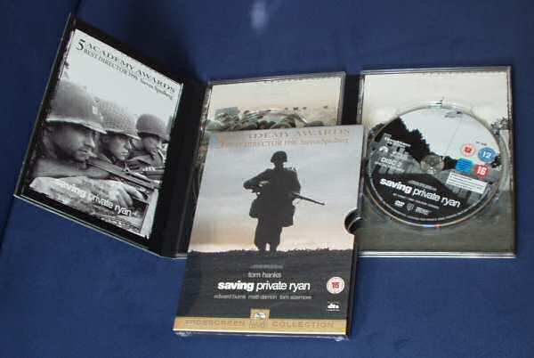
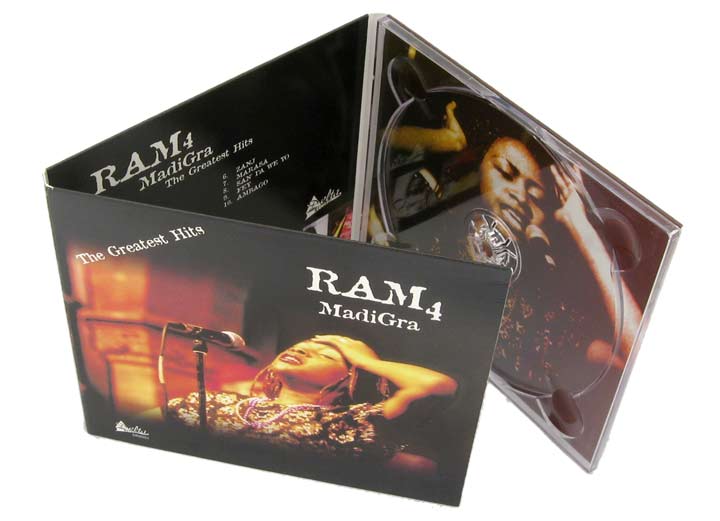
This is the standard layout for a CD digipack which is the one we are most likely to use. It has three panels, includes a booklet and the CD. 

This is one style that could be used. Instead of folding out in to a straight line it opens up on each side of the cd with each panel displaying images. There is also a booklet with all the lyrics plus various information inside a pocket on one of the panels.


This has the similar concept although instead of being a CD digipack it is a record album. This particular album opens up as a book with each page displaying all the lyrics with additional information and artwork, also followed by the record itself. As the song we have chosen to use in our media video was released within the record era it may even be an idea to produce it in this format.

Wednesday 23 November 2011

Candy Skull Front Cover DRAFT

    FIRST DRAFT:


    SECOND DRAFT:


I filled in some of the gap around the mouth. I plan to colour the skull in soon to see how it'll look. If it doesn't look particularly nice, I'll start again. After it's coloured in, i shall scan the picture and use editing software to make it look more professional.

Ideas for the Digipak covers - Mexican Candy Skull

As we've previously said on the blog, the group plan to use a Mexican candy Skull design for one of the covers in the digipak. We eventually came up with the idea of drawing a candy skull onto a model (the girl who was featured in our music video) and use that as the front cover of our Digipak. 
Now, the only problem that we face is timing. We might not be able to get to her, paint her face and take the pictures that we need before Tuesday, which is the deadline for our Digipak so we've got a back up, which is using an actual skull drawing that we'll design ourselves. I've drawn a picture of a basic outline in the post before this and after i plan to modify it if my group want it to look different and colour it in with bright, vibrant colours like a conventional candy skull. 

Rough draft of our skull design

Rough Ideas for the Digipak


Research for front cover of Digipak

Initial Idea:


We used the outline from this skull for our own one. We really liked it as it wasn't too weird or scary but was just right and perfect for what we needed. We also tried to recreate the colour scheme of this skull because we really wanted to have a lot of colour with our own one to go along with the colourful Mexican theme.

We were going to use this skull as inspiration but the cheekbones were just too prominent. Although we did like the circle pattern around the eyes, similar to a few of the other skulls.


The above 2 images features crosses which we really liked. For some weird reason we decided to add this to our own skull and luckily it looks very good.


The above 2 images are of actual skulls with small beads glued onto them. They have a really tribal and are very colourful, especially the second one which we like.


We were draw to the red lips of this skull mainly as we feature red lipstick and lips in our video with our main girl, Julide. In our final image, we put red lips on our skull.

Second Idea:


If we were to paint a skull design on our model and main girl in the video, Julide we would have use the above image as our main inspiration. 


We later came across images of these girls who have painted skulls onto their faces, this idea was intriguing however it was not so practical for us as we only had a week left to compete everything. Although this would have been a good idea to use on our main girl who was in the music video, we decided not to go ahead with it, instead we went back to our first idea and created a hand drawing ourselves.

Inspiration for Digipak Front Cover


This is the centre of our inspiration for our Digipak. I remembered that i had picked one up from Venice Beach, California and this is an image of my very own Mexican candy skull. When i introduced the idea of this to my group they loved it and wanted to go ahead with it but create our own design. Alex Harvey then drew a rough sketch of the skull which we decided to use. Colours were then added to it to give it the soulful atmosphere. 

Ideas for Digipak


We really like the idea of this Mexican skull head and are thinking of creating our own design based on it for our Digipak to go on the CD disk. These skulls are found in Venice Beach, California. Although the song has a mexican influence, it is still related to Mexicali, which is a part of California. Mexicali is also quoted in the lyrics of our song, "Down in Mexicali". We could take the outline of this skull and fill it in with our own design and colours to make it unique and striking. 

Tuesday 22 November 2011

Digipak Research


Digipak is a patented style of CD, DVD or BD packaging, and is a registered trademark of AGI World Ltd., an Atlas Holdings company. *

Teenage Dream by Katy Perry (2010)

Katy Perry is an American musician from Santa Barbara, California. Teenage Dream is her third album and was released on August 24th 2010 through Capitol Records. The front cover is of Katy Perry naked in candy floss which is from her first single and massive hit, "California Gurls". Sex sells and Katy has the appeal and more importantly her album cover does as well. It worked as in it's first week it sold 192,000 copies and debuted at number one on the American Billboard 200. The  album has various photos of Katy wearing candy based outfits that fit in with her food themed album. The CD it's self is designed like an American strawberry candy. The visual theme of the album is a novelty and people might just buy it because of that but it looks quite interesting and thought through. They don't just stop at the visuals with the food theme, it is printed with a candy floss scent which lasts for a long time. At first, only special copies had this which made them more sought after but now all them have it. People will buy this album mainly for the unique scent. It is quite a rare thing for a CD to have a scent and a nice one for that matter. The target audience for this album will mostly be young females but any fan of Katy Perry's will be likely to buy this and even more because of the candy floss scent.

*source: Wikipedia

Example's of different digipaks

CD Digipaks:


.

...and a DVD Digipak:

Magazine analysis

Beyonce - Best thing I've ever had. 


Beyonce is a very well known artist, so her name alone will attract attention. The advert itself is to promote her song 'Best thing I've ever had' and this is a a still image that was possibly taken from her music video that goes with this song.
Her name is the largest piece of text on the page, but the colour of the text is not too over powering, which allows the audience to appreciate the image without being too put off. Also, the 'guests' who are attending Beyonces' wedding in the image are all facing her, and I believe that it's not just because she's the bride and everyone turns round to look when she enters, but I believe this image has been specifically chosen because Beyonce is the center of attention in this ad.
Overall the advert does what it's meant to do. Attract interest.

Analysis of Digipaks.

The Pretty Reckless - Light me up Album. 


The Pretty Reckless are an american rock band from
New York. The front of the CD case is a picture of a
young child (which is meant to be a younger version of Taylor Momsen, the lead singer of the group) with a lighter. There has been a lot of controversy about how Taylor dresses as well as the fact that she has smoked from the age of 13, so the band have decided to dress the young girl like Taylor, implying that although she may be young, she's not afraid to 'break rules'

The colours are a basic gray, black and white with the Album title in red, which is linked to fire and that connects well. The red is also very eyecatching, which would help raise interest in TPR's music. The same applies with the back of the casing, which is a black and white natural looking picture of the band with the song titles in red. Overall this dark digipak reflects that band well and would seem attractive to their fans.

Album cover (digipak) ideas

Our digipak cover ideas are based upon the images of the cast of the music video, the cover will have the name of the artist and album name on it, and with the use of various colours, it will look quite soulful and mexican. The album cover and magazine advertisement is aimed at a target audience of young adults and above.

CD Advertisements Research

This is an advertisement for the American band, Eagles. The layout of it is very simple yet effective. The simple layout is very modern and probably their marketing technique to attempt to sell to a younger and influential audience. The whole page is of the desert and in a bold white font it says "EAGLES". At the bottom it says in a big font that it is "the number 1 album". This bold statement attracts the mature audience of Empire magazine. The Eagles were very successful in the 1970's and this is one of their more recent albums. The target audience for their music will be slightly vague as they have been performing for so long but this advertisement is featured in a magazine like Empire which is very respected and have a mature target audience. 
This CD advertisement is for the a 'greatest indie records of all time' which includes the hugely successful British band, The Smiths. The Smiths have done very well and to target their key audience they used an image of the band from their 'hey-day'. This black and white image also gives the advertisement a vintage feel which is very popular in culture today. The text is on a piece of paper from a notepaper and the CD that is being advertised is on it. The text is informal and slightly like handwriting, they are probably trying to give the affect that it is all scribbled down on some paper. "The Smiths" and "plus! free 15 track indie CD!" are both in red whereas the rest is in black and a slightly smaller font. Even though this is a compilation CD with various artists on from the 'indie' genre they have greatly focused in on The Smiths and used them to sell it.

Rough Idea for CD Front Cover


This is the rough draft of what we want our CD front cover to look like. It will have the girl, Julide in the middle of the two men; the other guy (Adam) and the lead singer (Dan) who will be holding his guitar. In the background will be the band holding most of their instruments with the exception of the drum kit so the drummer will most likely be holding just his drum sticks. As the song "Down in Mexico" came out in 1956 we are planning on doing a 55th anniversary special on the cover which would be the reason why it's being re-released. In the photo above of the rough draft, I, Katy, accidently wrote 65 instead of 55 for the anniversary.

Magazine advert research

Here is a magazine advert advertising the artist La Roux's new album. The entire two pages are used up for this ad and there is a seperate page for the text. This advert is quite spread out in terms of space, using a close up image of the artists face on one side of the page, with her name printed on the same page in fairly large letters.

On the other page there are ratings and quotes about the album, this is a major part of the advertisement which will attract viewers. 

Wednesday 16 November 2011

Complications with editing the music video:

On the 15th of November, the school server got taken to be renewed and fixed because of vandals cut the wires and stole some computers out of the media suite. Afterwards, only around half of the computers worked so the editing phase was pretty slow to start with but we thought it was getting better until yesterday when all of the groups in our media could not log in to their school account and all of the audio that we loaded onto the music video had been removed. To add to this, nothing new that we had done could be saved. Because of this, we have to wait until next week for the computers to be back to normal so we are starting our 'digipaks' and the background research.
Today, Katy isn't in which meant that we could not get the optimum amount of work done that we probably could have completed.

Down in mexico original album cover analysis.

Before we start to create ideas for our digipak we must establish an in-depth understanding of the genre and year of release of our song. So that we can create a digipak which matches these, also it would be useful to analyse the original album cover so that we can understand the genre and band better.  
Genre: R'N'B/Soul
Year: 1959 (60s era) 
Image The image of the band is shown on the front cover of the album,  this is a conventional aspect for digipaks.


Colours A range of different colours such as yellow, green and orange in different shades,  have been used that we may not see much of in recent times on a R'n'b digipak but perhaps on a Soul one. The band are dressed in brown this co-ordinates them with the Digipak covers. 

Font and text The font of the name of the artist stands out in large white letters, the text is capitalized and so is the album name which blends in with the colours in the background 

Extras Shown on the top left hand corner is a logo - this is a conventional part of a digipak.

Research: Analysis of digipaks according to various genres.

Every Genre has its own conventions for digipaks. including images, colours, designs, text style and other conventions analyzed below. For the last two analysis' i have chosen to analyze an R'N'B and a Soul genre digipak seperately, because our chosen song for the music video and digipak is a combination of R'N'B and Soul.


POP


Britney Spears - Circus


Images The pop artists tend to use pictures of themselves on their album cover, and the image they portray in the cover of the album speaks out the theme of the album. Here, shown on Britney Spears' album cover, there is an image of her posing on the front cover, the circus theme is shown on the back cover along with the track listings and CD content. The front cover does not give as much away as the back cover, however it is still eye catching all the same, with simple borders used. 


Colours The colours shown on the front cover are pastel colours, the back cover shows the much darker, stronger and more radiant colours with are pleasing to the eye. The red used on the front cover stands out with the artists name. 


Fonts and Text The placement of the album name 'circus' is right at the centre bottom of the digipak, the artists name has been highlighted in bold colours and size above. This style is highly representative of the Pop genre (bright colours and bold lettering). 


Themes The album is called 'circus' therefore it is set around the theme of a circus, with images representing a circus-like Britney.


Extras The barcode has been shown on the back cover with the ISPN, aside some logos in small images, a website is also shown in large letters to grab the audience's attention. There is also some small print on the digipak in white text. 


R'N'B


Drake - Take Care


Images This album cover consists of the image of the artists face. There is also a parental advisory label on the front cover.


Colours The colours used are dark and an effect has been used on the artists face fading into the black. The colour of half the artists face fades from blue/green to black - rather than his full face showing. The black background highlights the text more fully especially the faded white album title shown below the artists name. 


Fonts and text The artists name is shown in white, in simple capital letters, this text, although simple, makes a statement on the front cover. this is another convention of digipaks. It is possible to assume that the artists name must stand out more than the album name, it must have a more eye-catching image. 

Themes The blue/green colour fading almost creates a slightly 'dark' theme


SOUL


Marcio Local - Says don day don dree don don 


Image This album cover has similar qualities to that of the original digipak of the song we have chosen and it incorporates shapes such as lines and also bright colours. The pop art effect of the artists face makes the digipak look artistic.

Fonts and text A range of fonts and text sizes have been used to create an unusual but interesting look. The artists image is covered in words, a look we may not see today on digipaks.

Theme The theme speaks for itself it is bright and joyful, the colours create a 'happy' feel.